Responsive Headings
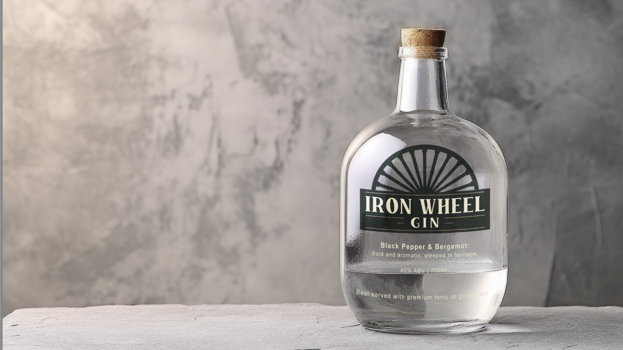
Iron Wheel Gin is a bold and timeless spirit inspired by the rich heritage of coal mining and the industrial revolution. The design draws on the strength and endurance of the miners, with a minimalist logo featuring the iconic iron wheel—symbolising the machinery that powered the mines.
Crafted for those who appreciate bold, aromatic flavors, Iron Wheel Gin combines the sharpness of black pepper and the citrus brightness of bergamot, evoking the enduring spirit of the mines. Ideal for adventurous drinkers and those who seek a drink that is both strong and full of character, Iron Wheel Gin is a tribute to the resilience and heritage of the coalfields, bringing a taste of the past into the present.
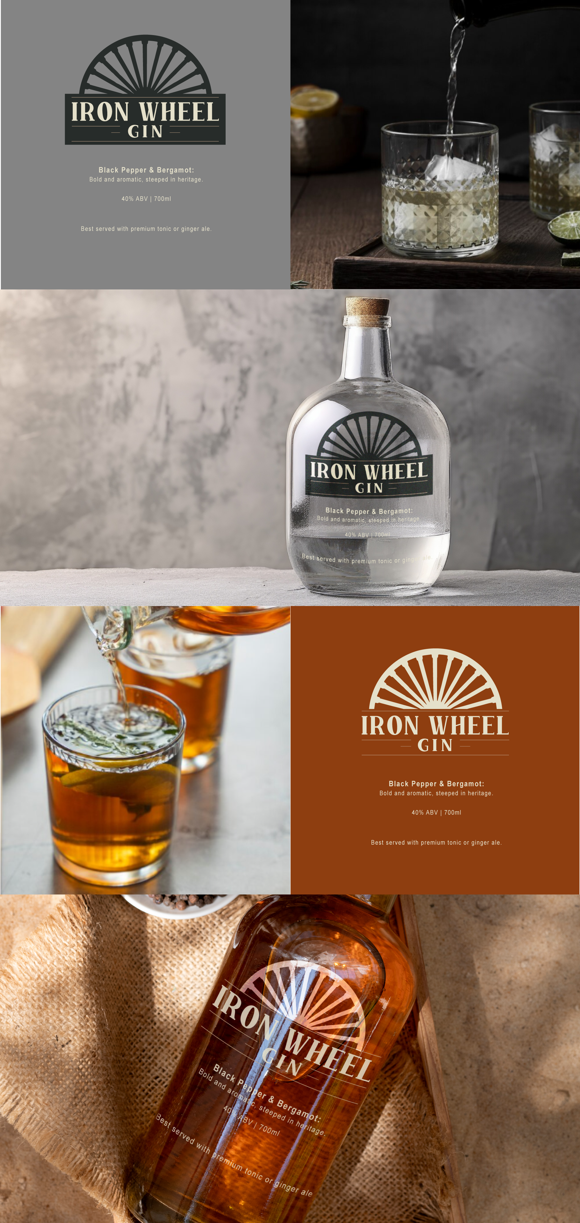
To create a versatile and dynamic brand identity for Iron Wheel Gin, I’ve chosen two distinct colorways to complement different gin profiles. The first design features a bold, black logo set against the light and clear gin liquid, ensuring that the strong, industrial aesthetic stands out and reflects the gin’s bold and aromatic character.
The second variation uses a lighter logo for darker gin colors, providing a balanced and elegant contrast that allows the rich, deep hue of the gin to take center stage. This dual approach ensures that no matter the gin’s color, the brand’s identity remains consistent and striking, while enhancing the overall presentation and appeal of the product.
Iron Wheel Gin is a bold and timeless spirit inspired by the rich heritage of coal mining and the industrial revolution. The design draws on the strength and endurance of the miners, with a minimalist logo featuring the iconic iron wheel—symbolising the machinery that powered the mines.
Crafted for those who appreciate bold, aromatic flavors, Iron Wheel Gin combines the sharpness of black pepper and the citrus brightness of bergamot, evoking the enduring spirit of the mines. Ideal for adventurous drinkers and those who seek a drink that is both strong and full of character, Iron Wheel Gin is a tribute to the resilience and heritage of the coalfields, bringing a taste of the past into the present.
To create a versatile and dynamic brand identity for Iron Wheel Gin, I’ve chosen two distinct colorways to complement different gin profiles. The first design features a bold, black logo set against the light and clear gin liquid, ensuring that the strong, industrial aesthetic stands out and reflects the gin’s bold and aromatic character.
The second variation uses a lighter logo for darker gin colors, providing a balanced and elegant contrast that allows the rich, deep hue of the gin to take center stage. This dual approach ensures that no matter the gin’s color, the brand’s identity remains consistent and striking, while enhancing the overall presentation and appeal of the product.